Feeds:
Posts
Comments

It’s been 3 weeks since I started working at Microsoft GTSC, I have been fiddling around with a lot of Microsoft tools and can’t help myself admiring the ease of use and thought which has gone into developing each of the tools which makes my job easier.

One such indispensible tool is Outlook. I am using Outlook 2007 which is connected to Exchange server. In Microsoft, most communication happens through E-mail. If you want to schedule a meeting, assign a task, block your training hours – Outlook comes in handy.

I am a big fan out Outlook, particularly the Calendar feature. It lets me manage my time and plan for the day efficiently, but I have a minor problem :

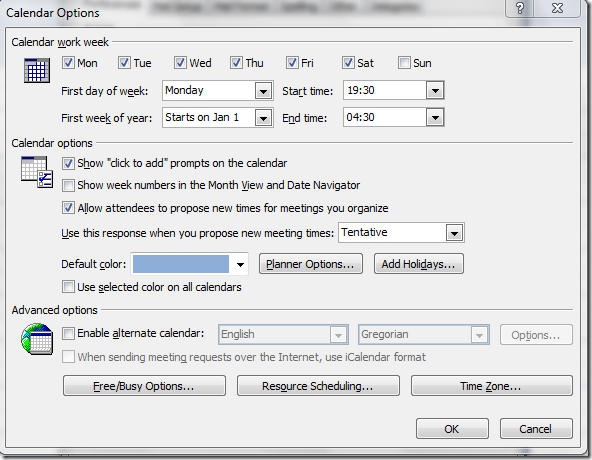
By default, the work hours in Outlook are set to begin at 0800 and end at 1500. You can of course customize it to reflect your work hours by going to

Tools –> Options –> Preferences –> Calendar options

Calendaroptions

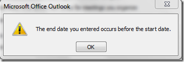
You can easily set your start and end time, but here’s my problem. My work starts at 1930 and ends at 0430. I tried entering the same and threw me an error saying “The end date you entered before the start date”.

Capture

By default all the weekdays were selected, and If I start at Friday 1930, the end date falls on a Saturday. I thought this would fix the problem. I tried again after checking on Saturday. Ding! Again! “The end date you entered before the start date”.

I binged to see if there is a possible solution or workaround online, and I found these 2 KB articles

http://support.microsoft.com/kb/177810 for Outlook 97

http://support.microsoft.com/kb/196804 for Outlook 2003

Both, stating There is no workaround for this behaviour. So this has been there for long and as I can see, this has not been fixed even in Outlook 2007.

Hopefully it will be fixed in the next version of Outlook. Till then my work timings at least in outlook is 0800 to 1700!
Technorati Tags: ,

September is the month of premieres and some season premieres. I love the season premieres of my old favorites and found some new ones which are surprising good, and one show which was surprising bad!

What’s new?

The Good Wife: This is the story of Alicia Florrick (Julianna Margulies) who is an attorney by education turns into an attorney by Profession after her Husband, a State Attorney gets caught in a corruption and a sex scandal. A legal Drama with a tinge of family issues. Looks promising, but it’s too early to say.

Rating: 7/10

Modern Family: A Mocumentary with the tag line – One big (straight,gay,multi-cultural, traditional) happy family. The writers do have a good sense of humour. It’s very different from what normally comes on TV. The way they connect the ‘micro-families’ together is indeed brilliant. Give it a shot if you like comedy and want something different.

Rating 8/10

The Cleveland Show: Honestly, the only reason I gave this show a try is coz it’s an off shoot of Family Guy, one of all time favorite. Cleveland leaves Quahog(the Family Guy town) and plans to live in California. I am surprised Seth MacFarlane screwed it up so badly. It’s anything but funny. It was downright boring! I will still give it a second chance and see how it fares up next time. Right now, it’s a thumbs down!

Rating 3/10

Old Dog, new tricks : Season Premieres

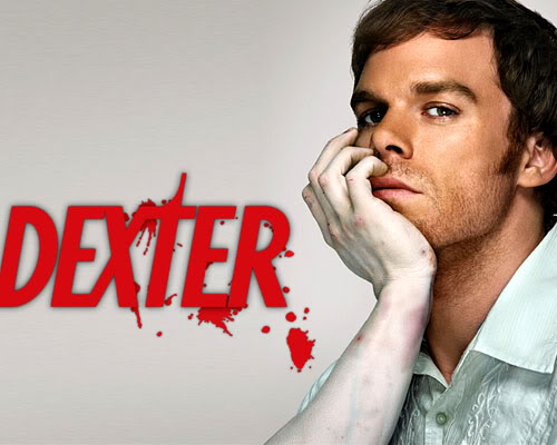
dexter_1Dexter: Dexter is back, and it’s back with a bang. Dexter is a Family man, and I thought this would deteriorate the thrills and chills this show brings you – I was wrong! The first episode was fast paced and entertaining with a twist in the end typical of Dexter episodes. If you have not been watching Dexter, you are missing out on a lot of Entertainment.

Rating 9/10

The Big Bang Theory: The latest episode of Big Bang Theory exceeded my expectations. Lot of Chemistry between Lenard and Penny. Sheldon is at his usual best. I am surprised he didn’t win an Emmy this year! I have seen many people with a ‘I don’t get it’ look on their face after watching BBT. You will really enjoy the show if you know your high school science stuff and can relate to it. A show I truly look forward to watching every week.

Rating 8/10

How I Met Your Mother:

HIMYM is back again. I remember watching this show for hours together. I was addicted to it. The characters are really lovable and Barney is simply superb! Lily, Robin, Marshall, Ted and Barney are a treat to watch. Now that Barney is going out with Robin makes it even more interesting. A must watch.

Rating 8/10

I plan to check out more new series, I will add them to the list as I watch them. Suggest me some good tv shows which you love.

Google’s Gtalk is a bit confusing right now. Some features which are available on the web client (read Gmail) aren’t available on the Desktop Client. You can’t be invisible and receive files from your friend!

You can’t talk to your friend and have a group chat at the same time! It’s ridiculous.

GoogleTalkLogo_1

I wonder if people use Gtalk only because it logs you on automatically when you check your mails on Gmail!

Though I like the web based client, the desktop client never ceases to irritate me.

1.  Show current music track –

If I try to set my status message to ‘Show current music track’. It crashes! I know it doesn’t happen to everyone, but I know a lot of folks who are facing the same nuisance. This happens if you are using a Media Player which is not Windows Media Player, iTunes or Winamp (with some tweaks).

2.  Sending a receiving files

If am logged on to the web client and on to the Desktop client at the same time. I cannot receive files! Closing the Gmail window doesn’t help too. This is highly irritating, and is miraculously solved when I relogin in the desktop client. So much for ease of use!

3. Group chat

People who have been using the Desktop Client only will not have an idea what I am talking about. It’s true you can have a Group chat in Gtalk, but it’s only using the web client. You get an invitation to join a conference and the group chat opens in a new chat window. It’s quite useful sometimes, but why not have it in the desktop client!!

4.Enable  Video chat in desktop edition

Google had recently introduced Video chat on the web client, but not on the desktop client! Weird… It should have been the other way round

5.  Organize Contacts –

I wonder why this never occurred to Google. The labels feature in Gmail is very creative, why not create a similar thing for contacts. I hate to see a long list of contacts in Gtalk. Yahoo and Live Messenger have had similar feature since a very long time. Why hasn’t Google given much thought towards it?

I agree it fairs high on the ease of use and simplicity aspects, but add a little more productivity to this and this will one day become one of the best IMs.

6. Set as Invisible –

This was a killer feature when it was first introduced in other Instant Messengers. Again, this feature is available in the browser edition of gtalk but sadly not in the client application. Yahoo actually goes a step further where in you can appear invisible (kinda oxymoron :P) to select few of your friends.

7. Rich Text Format text area –

RTF allows you to express yourself better. Again, most other IMs have it, why not Gtalk?

Do you have any feature in mind which could enrich your experience with Gtalk? Discuss in the comments section.

Corporate logo design tips

It was 1998 when I first entered the world of Internet. My first email id on netaddress.com and to visit the WWF (now WWE) website. Since then, I have come across a lot of logos, designed some – using Fireworks, Flash and what not. I will tell you some of the things which I have learned in the process.

First of all, some of the really good looking ones are not ‘efficient’..and some really ‘efficient’ ones are not all that attractive..

There are some sites like logolabsLogoworks and others who will design logo drafts for you at a cost of around $100. The samples on some of the premium logo design sites will definitely astound any prospective client. But, in the end it all boils down to an unique font accompanied occasionally by a graphic.

Some logos have a story behind the way it is designed, say Amazon where the orange arrow from A to Z indicates everything is available and also looks like a smile. It’s good to have a ‘meaningful’ logo, but not all logos need to have an inner meaning.

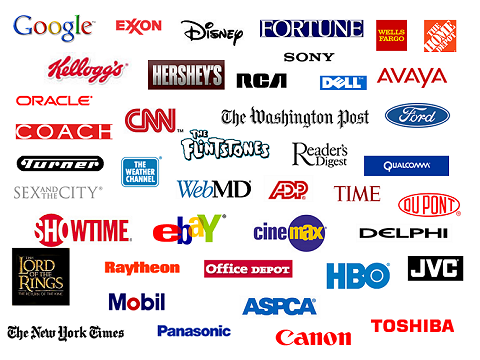
Some Popular Logos

Some Popular Logos

If you are a careful observer, you must have observed that logos of most successful corporations are designed to be very simple. Still it makes a huge impact. You don’t want your corporate logo to look like a name of some rock band. Do you?
Major Corporations like HP, Microsoft, Oracle, Xerox, Nike, Jockey and others have very simple looking logos, yet it makes a strong impression on you. Even top Game producing companies like EA, and animation companies like Pixar and Dreamworks have simple logos.

Here are some tips to keep in mind while designing a corporate logo :

  • Use simple fonts : Some complex looking fonts might impress you at first, but keep in mind that your logo must be displayed and printed on a variety of items. e.g., Font like Times New Roman looks good when printed, but is not so readable on a computer screen. A company’s logo must go on a letterhead, business cards and other printed material as well as on display media such as Computer and TV screens. So go for a fonts which look good on both.
  • Use Vector Graphics: If your logo draft is hand drawn, try to make a vector replica of it. You can use tools like Adobe Illustrator, Corel Draw or even Photoshop to achieve the same. Using a vector graphic has one BIG advantage. Your logo can be upscaled or downscaled to any proportion without losing clarity. This becomes very important when you put up your logo on large banners or hoardings.
  • Use a high resolution : Most image editing software lets you define a Resolution in Pixels Per Inch. This is very important if you can’t create a vector replica of your logo and choose to use non-vector version. A high resolution ensures that your logo doesn’t look pixellated when enlarged or when printed on paper. Generally 72 PPI is recommended for graphics which are used exclusively on the web which is seldom the case. Anything above 600 PPI will make your image look crystal clear when printed with a high quality printer.
  • Use minimum colors: A colorful logo might appear very attractive when viewed on a computer, but has serious drawbacks. Imagine you choose to order t-shirts or coffee mugs with your logo embroidered or printed. Use of minimum and easily reproducible colors will make your life much easier. If possible, try to design a monochrome logo which looks good on a variety of backgrounds.
    Also, if the color of the logo matches with the background, it is advisable to go for the inverted-version of your logo.
    By inverted I mean to say – If your current design is in white, make it black and vice versa. Technically if the color of your logo is (R,G,B), the inverted logo color will be (255-R, 255-G, 255-B).

You can get a good collection of free fonts from dafont, Urban fonts and Free Fonts. Also here is a link to top 100 most popular professional fonts by Just Creative Design.

Hope these small tips help you. Please leave a link to your logo, if you happen to design one after reading this article.

-Sriranga